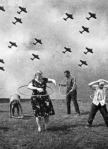
UnderStanding
(Space)
 |
| Max Ernst, Day and Night, 1941 |
 |
| Qaddafi |
 |
| Gene Simmons |
 |
| Holland Taylor |
 |
| Jane Fonda |
The unbounded warmth of red has not the irresponsible appeal of
yellow, but rings inwardly with a determined and powerful
intensity. It glows in itself, maturely, and does not distribute
its vigour aimlessly.
The varied powers of red are very striking. By a skillful use of
it in its different shades, its fundamental tone may be made warm
or cold.

[Footnote: Of course every colour can be to some extent varied
between warm and cold, but no colour has so extensive a scale of
varieties as red.]

Light warm red has a certain similarity to medium yellow, alike
in texture and appeal, and gives a feeling of strength, vigour,
determination, triumph. In music, it is a sound of trumpets,
strong, harsh, and ringing.

Vermilion is a red with a feeling of sharpness, like glowing
steel which can be cooled by water. Vermilion is quenched by
blue, for it can support no mixture with a cold colour. More
accurately speaking, such a mixture produces what is called a
dirty colour, scorned by painters of today. But "dirt" as a
material object has its own inner appeal, and therefore to avoid
it in painting is as unjust and narrow as was the cry of
yesterday for pure colour. At the call of the inner need that
which is outwardly foul may be inwardly pure, and vice versa.

The two shades of red just discussed are similar to yellow,
except that they reach out less to the spectator. The glow of red
is within itself. For this reason it is a colour more beloved
than yellow, being frequently used in primitive and traditional
decoration, and also in peasant costumes, because in the open air
the harmony of red and green is very beautiful. Taken by itself
this red is material, and, like yellow, has no very deep appeal.
Only when combined with something nobler does it acquire this
deep appeal. It is dangerous to seek to deepen red by an
admixture of black, for black quenches the glow, or at least
reduces it considerably.

But there remains brown, unemotional, disinclined for movement.
An intermixture of red is outwardly barely audible, but there
rings out a powerful inner harmony. Skillful blending can produce
an inner appeal of extraordinary, indescribable beauty. The
vermilion now rings like a great trumpet, or thunders like a
drum.

Cool red (madder) like any other fundamentally cold colour, can
be deepened--especially by an intermixture of azure. The
character of the colour changes; the inward glow increases, the
active element gradually disappears. But this active element is
never so wholly absent as in deep green. There always remains a
hint of renewed vigour, somewhere out of sight, waiting for a
certain moment to burst forth afresh. In this lies the great
difference between a deepened red and a deepened blue, because in
red there is always a trace of the material. A parallel in music
are the sad, middle tones of a cello. A cold, light red contains
a very distinct bodily or material element, but it is always
pure, like the fresh beauty of the face of a young girl. The
singing notes of a violin express this exactly in music.
Warm red, intensified by a suitable yellow, is orange. This blend
brings red almost to the point of spreading out towards the
spectator. But the element of red is always sufficiently strong
to keep the colour from flippancy. Orange is like a man,
convinced of his own powers. Its note is that of the angelus, or
of an old violin.

Just as orange is red brought nearer to humanity by yellow, so
violet is red withdrawn from humanity by blue. But the red in
violet must be cold, for the spiritual need does not allow of a
mixture of warm red with cold blue.

Violet is therefore both in the physical and spiritual sense a
cooled red. It is consequently rather sad and ailing. It is worn
by old women, and in China as a sign of mourning. In music it is
an English horn, or the deep notes of wood instruments (e.g. a
bassoon).

[Footnote: Among artists one often hears the question, "How are
you?" answered gloomily by the words "Feeling very violet."]

The two last mentioned colours (orange and violet) are the fourth
and last pair of antitheses of the primitive colours. They stand
to each other in the same relation as the third antitheses--green
and red--i.e., as complementary colours.
As in a great circle, a serpent biting its own tail (the symbol
of eternity, of something without end) the six colours appear
that make up the three main antitheses. And to right and left
stand the two great possibilities of silence--death and birth.


Plutchik's Wheel of Emotions
It is clear that all I have said of these simple colours is very
provisional and general, and so also are those feelings (joy,
grief, etc.) which have been quoted as parallels of the colours.
For these feelings are only the material expressions of the soul.
Shades of colour, like those of sound, are of a much finer
texture and awake in the soul emotions too fine to be expressed
in words. Certainly each tone will find some probable expression
in words, but it will always be incomplete, and that part which
the word fails to express will not be unimportant but rather the
very kernel of its existence. For this reason words are, and will
always remain, only hints, mere suggestions of colours. In this
impossibility of expressing colour in words with the consequent
need for some other mode of expression lies the opportunity of
the art of the future. In this art among innumerable rich and
varied combinations there is one which is founded on firm fact,
and that is as follows. The actual expression of colour can be
achieved simultaneously by several forms of art, each art playing
its separate part, and producing a whole which exceeds in
richness and force any expression attainable by one art alone.
The immense possibilities of depth and strength to be gained by
combination or by discord between the various arts can be easily
realized. Not without reason is white taken as symbolizing joy and spotless purity, and black grief and death.
A blend of black and white produces gray which, as has been said, is silent and motionless, being composed of two inactive colours, its restfulness having none of the potential activity of green.
A similar gray is produced by a mixture of green and red, a spiritual blend of passivity and glowing warmth.
[Footnote: Gray = immobility and rest. Delacroix sought to express rest by a mixture of green and red (cf. Signac, sup. cit.).]

Delacroix, Mademoiselle Rose, 1817-1824

 |
| Kandinsky, Painting with red spot, 1914 |
frequent exercise. ...
The starting point is the study of colour and its effects on men.
There is no need to engage in the finer shades of complicated
colour, but rather at first to consider only the direct use of
simple colours.
...
Two great divisions of colour occur to the mind at the outset:
into warm and cold, and into light and dark. To each colour there
are therefore four shades of appeal--warm and light or warm and
dark, or cold and light or cold and dark.
Generally speaking, warmth or cold in a colour means an approach
respectively to yellow or to blue. This distinction is, so to
speak, on one basis, the colour having a constant fundamental
appeal, but assuming either a more material or more non-material
quality. The movement is an horizontal one, the warm colours
approaching the spectator, the cold ones retreating from him.
The colours, which cause in another colour this horizontal
movement, while they are themselves affected by it, have another
movement of their own, which acts with a violent separative
force. This is, therefore, the first antithesis in the inner
appeal, and the inclination of the colour to yellow or to blue,
is of tremendous importance.
The second antithesis is between white and black; i.e., the
inclination to light or dark caused by the pair of colours just
mentioned. These colours have once more their peculiar movement
to and from the spectator, but in a more rigid form....Yellow and blue have another movement which affects the firstantithesis--an ex- and concentric movement. If two circles are
drawn and painted respectively yellow and blue, brief
concentration will reveal in the yellow a spreading movement out
from the centre, and a noticeable approach to the spectator. The
blue, on the other hand, moves in upon itself, like a snail
retreating into its shell, and draws away from the spectator.
[Footnote: These statements have no scientific basis, but are
founded purely on spiritual experience.]
In the case of light and dark colours the movement is emphasized.
That of the yellow increases with an admixture of white, i.e., as
it becomes lighter. That of the blue increases with an admixture
of black, i.e., as it becomes darker. This means that there can
never be a dark-coloured yellow. The relationship between white
and yellow is as close as between black and blue, for blue can be
so dark as to border on black. Besides this physical
relationship, is also a spiritual one (between yellow and white
on one side, between blue and black on the other) which marks a
strong separation between the two pairs.
An attempt to make yellow colder produces a green tint and checks
both the horizontal and excentric movement. The colour becomes
sickly and unreal. The blue by its contrary movement acts as a
brake on the yellow, and is hindered in its own movement, till
the two together become stationary, and the result is green.
Similarly a mixture of black and white produces gray, which is
motionless and spiritually very similar to green.
But while green, yellow, and blue are potentially active, though
temporarily paralysed, in gray there is no possibility of
movement, because gray consists of two colours that have no
active force, for they stand, the one in motionless discord, the
other in a motionless negation, even of discord, like an endless
wall or a bottomless pit.
Because the component colours of green are active and have a
movement of their own, it is possible, on the basis of this
movement, to reckon their spiritual appeal.
The first movement of yellow, that of approach to the spectator
(which can be increased by an intensification of the yellow), and
also the second movement, that of over-spreading the boundaries,
have a material parallel in the human energy which assails every
obstacle blindly, and bursts forth aimlessly in every direction.
Yellow, if steadily gazed at in any geometrical form, has a
disturbing influence, and reveals in the colour an insistent,
aggressive character. [Footnote: It is worth noting that the
sour-tasting lemon and shrill-singing canary are both yellow.]
The intensification of the yellow increases the painful
shrillness of its note.
[Footnote: Any parallel between colour and music can only berelative. Just as a violin can give various shades of tone,--soyellow has shades, which can be expressed by various instruments.But in making such parallels, I am assuming in each case a puretone of colour or sound, unvaried by vibration or dampers, etc.]
Yellow is the typically earthly colour. It can never have
profound meaning. An intermixture of blue makes it a sickly
colour. It may be paralleled in human nature, with madness, not
with melancholy or hypochondriacal mania, but rather with violent
raving lunacy.
The power of profound meaning is found in blue, and first in its
physical movements (1) of retreat from the spectator, (2) of
turning in upon its own centre. The inclination of blue to depth
is so strong that its inner appeal is stronger when its shade is
deeper.
Blue is the typical heavenly colour.
[Footnote: ...The halos are golden for emperors and prophets
(i.e. for mortals), and sky-blue for symbolic figures (i.e.
spiritual beings); (Kondakoff, Histoire de l'An Byzantine
consideree principalement dans les miniatures, vol. ii, p. 382,
Paris, 1886-91).]
The ultimate feeling it creates is one of rest.
[Footnote: Supernatural rest, not the earthly contentment of
green. The way to the supernatural lies through the natural. And
we mortals passing from the earthly yellow to the heavenly blue
must pass through green.]
When it sinks almost to black, it echoes a grief that is hardly
human.
[Footnote: As an echo of grief violet stand to blue as does green
in its production of rest.]
When it rises towards white, a movement little suited to it, its
appeal to men grows weaker and more distant. In music a light
blue is like a flute, a darker blue a cello; a still darker a
thunderous double bass; and the darkest blue of all-an organ.
A well-balanced mixture of blue and yellow produces green. The
horizontal movement ceases; likewise that from and towards the
centre. The effect on the soul through the eye is therefore
motionless. This is a fact recognized not only by opticians but
by the world. Green is the most restful colour that exists. On
exhausted men this restfulness has a beneficial effect, but after
a time it becomes wearisome. Pictures painted in shades of green
are passive and tend to be wearisome; this contrasts with the
active warmth of yellow or the active coolness of blue. In the
hierarchy of colours green is the "bourgeoisie"-self-satisfied,
immovable, narrow. It is the colour of summer, the period when
nature is resting from the storms of winter and the productive
energy of spring.
Any preponderance in green of yellow or blue introduces a
corresponding activity and changes the inner appeal. The green
keeps its characteristic equanimity and restfulness, the former
increasing with the inclination to lightness, the latter with the
inclination to depth. In music the absolute green is represented
by the placid, middle notes of a violin.
...pp. 36-9